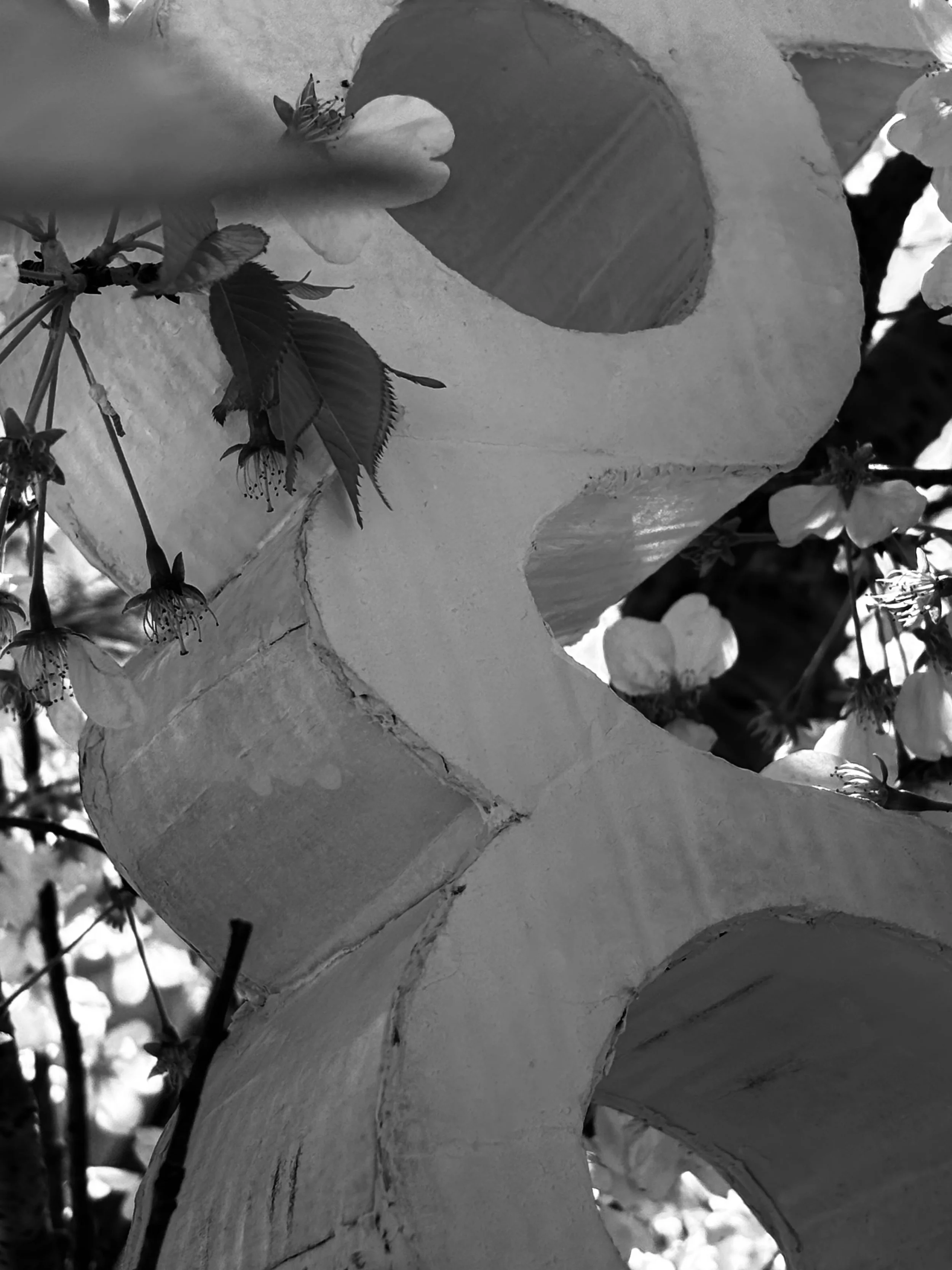
Flowing through the city
Branding / Print / 3d Space
Flowing Through the City is a project where we were asked to build a letterform from a classic typeface. I choose Gill Sans G because its structure has always fascinated me with its uniqueness. After constructing the letter, we were tasked with photographing it interacting with the environment. This is where the idea of Flowing Through the City came to life, the G’s curvy, flowing form. mirrored the movement and energy of the urban landscape as I took it around the city. The project explores how typography can move beyond the page and form a meaningful visual relationship with the space around us.

I chose the lowercase g from
the Gill Sans typeface for its distinctive, curvaceous form, which introduces a sense of fluidity and softness. This choice contrasts sharply against Boston’s predominantly linear and angular architecture. The juxtaposition highlights the interplay between the type and the environment surrounding it.


